When it comes to driving sales in a Costco, Sam’s Club, Walmart, or similar club store environment, it’s all about capturing the attention of the shopper and quickly communicating the value of your product.
In a sea of pallets and possibilities, consumers need your help to quickly spot and understand what you’re offering and why they should buy it. Standing out from the rest of the pack is essential to keeping your product available on the floor.
Luckily, the opportunity is there for the taking when designing a great pallet display. The corrugated stacking trays that your product is already packed in offer a generous amount of real estate that can be fully branded to effectively market your product to quick-moving consumers. Add a printed pallet skirt around the base and you’re in business!
However, be aware that when developing the graphics for your club store trays and pallet skirts, you may want to take a slightly different tact than you have with other branded graphics. Pallet displays are a very specific kind of “brand billboard” and you want to keep the shopper profile and the club store environment front-of-mind when designing for these retail powerhouses.
If you’re in the process of designing your club store packaging, just keep the letters “BCC” in mind. Be bold, clear, and concise. Here are three strategies to help you drive the most conversions from your pallet display:
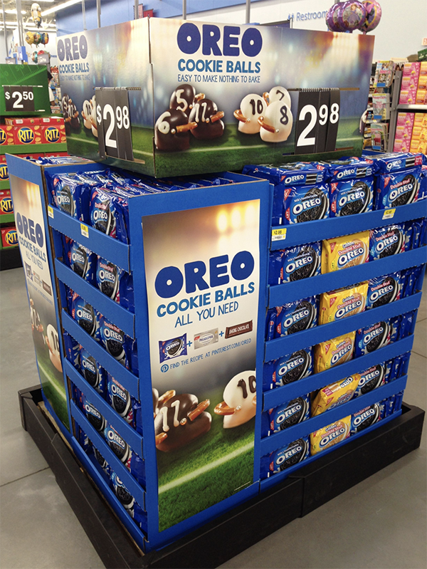
Pallet displays are viewed by the shopper from a distance and are placed alongside many other product displays. In club store environments you have only seconds to be seen. This means your graphics need to be distilled down to only the most essential and recognizable elements of your brand.

Source: pinterest.com
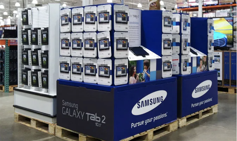
Using on-brand color blocking is a great way to create a bold visual that makes your pallet display and products look like one large object, which is easier for shoppers to see. Using large logos and fonts helps to boost recognition from a distance.
Consumers don’t have time to read paragraphs of text, or even full sentences. In as few words as possible, state how your product creates value for that individual. What makes your product so unique and different that they simply can’t pass it up? Make sure this value statement is clear, concise, and highly visible on your club store display.

Source: njnnetwork.com
If your product requires a bit of education or has supporting features that need to be communicated, skip the lengthy bullet points and use simple icons and brief text to convey each benefit.
![]()
Source: talkbusiness.net
If your brand guidelines don’t already include a library of icons, thousands of unique vector graphics can be found and purchased online on sites like iStock.
Communicating value is a game of speed and precision for club store pallet displays. Following these guidelines will ensure your product stands out and is easily recognized by consumers.
For assistance in increasing the shoppability of your pallet displays, contact our team of Packaging Advisors. Our team of award-winning structural designers and retail experts can help strategize on your graphics and develop the structural components for a winning result.

Learn how connected packaging can help your products stand out on shelves and keep that connection w …

Learn how to thrive as a Costco vendor with key metrics, packaging tips, and expert advice.

Learn smart, budget-friendly packaging solutions for small businesses and startups.